The Frequency Distribution calculator takes an input set of data, `X`, and creates a frequency distribution matrix of that data.
 5 bin Frequency Distribution for set:
(98, 90, 92,78, 76, 26, 58, 60, 66, 75,
95, 95, 100, 78, 85, 66, 100, 89, 80)
INSTRUCTIONS: Enter the following:
- (X) Set of Data (numeric list of comma-separated values)
- (Low) Lowest bin boundary of the data set X
- (High) Highest bin boundary of the data set X
- (Bins) Number of bins into which to split the range
Frequency Distribution: The calculator returns a count of all of the values of X in evenly spaced bins between the low and high values set by the user.
The Math / Science
The user specifies the boundaries of the possible range of `X` and the number of bins into which the user wishes to bin the frequencies. vCalc then splits the range into equal sub-ranges or "bins". The counts of data values falling between the upper and lower boundary of each bin is then displayed as the frequency distribution.
This calculator computes the possible range of `X` defined by the input Low and High values.
"Range"_X = "High" - "Low"`
The equation then splits the range up into the number of equal increments or frequency bins which is defined by the "Bins" input.
The frequency distribution is then computed and the count of data values which fall in each of the sub-range Bins is determined.
A count for each data value is put into the bin if the data value meets the condition:
- `"value"_X >= "bin's lower boundary AND value" < "bin's upper boundary"`
A count is added to the top bin if: `"value" = "High"`, the top of the range
Frequency Distribution Example
There are 19 student in the 1st year Algebra Class. They have just taken a test and we will check out how their test scores fall within the possible test score range.
The test score range is Low = 0 to High = 100.
Copy/Paste the following data set into the equation and set Bins to 5:
98, 90, 92,78, 76, 26, 58, 60, 66, 75, 95, 95, 100, 78, 85, 66, 100, 89, 80
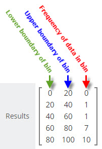
We get back a frequency distribution from vCalc that looks like the example image at the right:
This frequency distribution tells us that:
- there were no values in the frequency bin whose bounds are 0 to 20
- there was one value in the bin whose range is from 20 to 40
- there was one value in the bin whose range is from 40 to 60
- there were seven values in the bin whose range is from 60 to 80
- there were 10 values in the bin whose range is from 80 to 100.
What Does the Frequency Distribution Tell Us?
The frequency distribution tells us about how the data in a data set is distributed. In an easy-to-grasp visual the frequency distribution tells us that a sampled set of data has tendencies to fall in one part or another of a data range.
Our example of test data shows a grouping of most of the values at the top end of the range. Of course, this is what we expect to see in a class room led by a competent instructor. The instructor's goal is to help the student maximize their learning experience and the students strive to get high grades, so you would expect the frequency distribution to be skewed toward the upper bins of the grading scale.
If the scores resulting from a test were skewed toward the lower bins, the teacher would know the student were not grasping the lessons for some reason. From the frequency distribution chart for combined scores over a period of time, the instructor could gain some understanding of how significant the lack of understanding might be.
Real World Frequency Distributions
Frequency distributions with real-world data tend to follow a pattern referred to as a "normal distribution". When frequency distributions are applied to unbiased, real world data, you will often see a "normal distribution" or bell-shaped curve. This reflects the tendency of data in nature to cluster around the center of the possible range and taper off in the direction of both the upper and lower bounds.
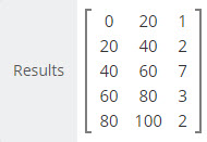
The data example at the right exhibits a somewhat normalized distribution with the center frequency bin showing 7 data values and the data values in the upper and lower bins showing fewer values as we move toward the Lowest and Highest bound of the data range for `X`.
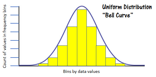
The figure at the left represents a normal distribution. You can see the obvious bell shape of the frequency values represented by the yellow columns.
See Also
- Draw from a Gaussian Distribution
- View a Frequency Distribution of a Gaussian Distribution
- View a Frequency Distribution of a Displaced Gaussian
- See a Frequency Distribution of Your Test Data
- Draw from a Gaussian Distribution
- View a Frequency Distribution of a Gaussian Distribution
- View a Frequency Distribution of a Displaced Gaussian
- See a Frequency Distribution of Your Test Data
- Draw from a Lognormal Distribution
- View a Frequency Distribution of a Lognormal Distribution

Statistics Calculators
- Observational Stats: This function accepts a table (rows and columns separated by commas) of numbers and calculates observational statistics for any of the columns. This includes count, min, max, sum, sum of squares (Σx²), square of the sum (Σx)², mean, median, mode, range, mid point, rand, sort up, sort down, rand, population variance, population standard deviation, the sample/experimental variance, sample/experimental standard deviation.
- Simple Stats: This is also provides a full set of observational stats, but on a single row of numbers separated by commas. The observational stats include count, min, max, sum, sum of squares (Σx²), square of the sum (Σx)², mean, median, mode, range, mid point, rand, sort up, sort down, rand, population variance, population standard deviation, the sample/experimental variance, sample/experimental standard deviation.
- Frequency Distribution: This function lets you enter a string of numbers separated by commas, a low and high range and a number of bins. It then computes how many of the observations are in each of the bins between the high and low values designated.
- Paired Sample t-test: This computes the various parameters associated with the Paired Sample t-test.
- ANOVA (one way): The computes the F Score and details for one way analysis of variance for a nxm matrix of observations.
- (χ2) Chi-Square Test: This computes the Chi-Square value for an nxm array of data and provides the degrees of freedom.
- Linear Regression
 : This computes the regression line (least-squares) through a set of X and Y observations. It also computes the regression coefficient (r).
 - Least-squares Trend Inference : This is a linear equation used with Linear Regression to compute a predicted value of Y based on X.
- Wilcoxon Signed Rank Test: This provides the Wilcoxon statistics and critical value for two groups of numeric observations based on an alpha value and whether it's a one or two tailed test.
- Slope-Intercept form of a Line: This provides the slope intercept form (y = mx+b) of a line based on two coordinates.
- Slope between two points: This provides the slope between two coordinates.
- Linear Equation: This computes the range (y) of a linear equation (y = mx +b) and includes a graphing function.
- Probability between z SCORES:
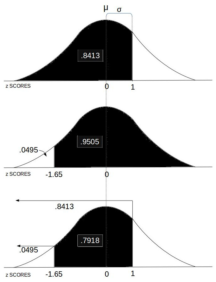 This computes the area under the Normal Distribution curve between two z SCOREs which equates to the probability of an event in that range.
 - Stats Calc: College level statistics calculator with a bundle including most of the functions in this list.
- Count: This computes the number (n) of observations in a set of numbers.
- Minimum: This computes the minimum (min) value in a set of numbers.
- Maximum: This computes the maximum (max) value in a set of numbers.
- Numeric Sort: This sorts (ascending or descending) a set of comma separated numerical observations.
- Random Sample (k items): The provides a random subset of a specified size (k) in a set of comma separated numerical observations.
- Random Real Number in Range: The provides a random real number between two specified real numbers (upper and lower bounds).
- Radom Integer: The provides a random integer between two specified integers (upper and lower bounds).
- Frequency Distribution: This provides a frequency distribution table for a comma separated set of numbers with a specified number of frequency bins between a lower and upper data range.
- Sum (Σx): This is computes the sum of the values in a set.
- Sum of Squares (Σx²): This computes the sum of the squared values in a set.
- Sum Squared (Σx)²: This computes the square of the summed values in a set.
- Mean (μ): This computes is the mean (average) of values in a set.
- Median: This identifies the middle ordered value in a set of numbers.
- Statistical Mode: This identifies the most recurring observation in a set of numbers.
- Mid Point: This is identifies the mid point of the observation range in a set of numbers.
- Range: This is computes the difference between the max and the min values in a set of number.
- Population Variance (σ2): This computes the variance, a metric regarding the spread of values, for a population set of numeric values.
- Population Standard Deviation (σ): This computes the standard deviation for a population set of numeric values.
- Sample Variance (s2) : This computes the variance, a metric regarding the spread of values, for a sample set of numeric values within a greater population.
- Sample Standard Deviation (s): This computes the standard deviation for a sample set of numeric values within a greater population.
- z SCORE Formula: This computes the z SCORE for a value base on the mean and standard deviation.
- z SCORE: This computes the z SCORE for a value (Raw Score) based on a set of values, and whether that set is sample or population.
- Percentile: This computes the percentile of a value (y) in a set (X) of values.
- Standard Deviation of Mean (SDOM): This computes the standard deviation of mean, sometimes also known as the standard error of the mean (SEM), useful to helps quantify the uncertainty in the estimate of the mean.
- Percent Relative Standard Deviation (%RSD): This computes the percent relative standard deviation, also known as the coefficient of variation (CV). The %RSD is a measure of the dispersion of a probability distribution.