Viewing data as a frequency distribution can give you a quick understanding of the central tendencies of the data.
Two vCalc equations let you view your own data as a frequency distribution. The first equation shows you a frequency distribution of a data set, `X`, where the range is defined to be the lowest value in the data set to the highest value in the data set:
Select Here = >> [Private Equation]
NOTE: many vCalc equations are embedded throughout vCalc descriptive pages like this page. Even though they may not stand out in the text, if you hover over the name of an equation it will likely be linked to an actual, pop-up executable equation. For example: Arithmetic Mode
Example: Frequency Distribution Between Min / Max Data Values
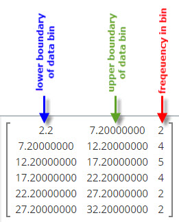
If you click on the equation link above or the link here => Frequency Distribution Between Min and Max Data Values <= , you can paste in the following data set into vCalc:
8.5, 2.2, 11, 20.6, 16, 32.2, 17, 17, 21.6, 13.5, 25, 25.7, 13, 5.5, 8.9, 20.1, 20, 11.5, 28
vCalc will display the frequency distribution that is shown to the right. You see the lowest bin from 2.2 to 7.2 has two data values. The highest bin from 27.2 to 32.3 also has two values. the data range for `X` is from 2.2 to 32.2 and thus each bin is 1/5 of that range.
`"Range" = (32.2 - 2.2) / 6 = 5`
vCalc displays the [Private Equation]
 Example: Frequency Distribution Across Possible Data Range
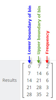
The second vCalc equation shows the frequency distribution across a range, where the range boundaries may be higher or lower larger than the data values.
Select Here = >> Frequency Distribution Across a Range of Possible Values
If you copy/paste the same data set from above in to this second equation, and define the range to be 0 to 35, we will see the results shown to the left.
The range is split into five bins so the range we defined 0 to 35 has bins of width 7.
You see two of the lower bins in the range have 6 values each in them. This shows a distribution skewed slightly to the lower end of the scale.
See Also
- Click here to see hundreds of statistics topics on vCalc
- Click here to apply some of the simplest statistics
- Start here with the basics of elementary statistics
- Click here to get a simplified view of mathematics
- Click here to understand the basic concept of Quantization
- Click here to read about frequency distributions
- Begin with the math of measuring central tendencies
- Click here to see basic psychology statistics
- Click here to see the category of Statistics in vCalc content
- Peruse the category of Engineering Probability and Statistics
- Try the Mean calculation
- Try the Median calculation
- Try the Mode calculation
- Here's the Range of a data set
- Here's the Min calculation
- And the Max calculation